Tuesday, December 1, 2009

Sunday, November 22, 2009
Lab 7: Spatial Analysis
The 2009 Station fire was the 10th largest megafire in California since 1933, lasting from August 26th to October 16th. The Station fire was responsible for burning 160,577 acres of the Angeles National Forest, destroying 209 structures, and killing 2 firefighters. Map 1 shows the total area of the Station fire as of September 2nd. The fire was a result of arson near the U.S. Forest Service ranger station which was concluded from an unidentified substance at the source of the blaze. The arsonist has not been caught and there is a $150,000 reward for information leading to the conviction of the arsonist.
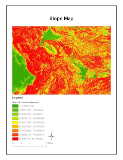
Southern California weather conditions and terrain made this fire so devastating. Droughts are not uncommon to the area, often lasting years; Southern California is currently on its fourth straight year of below average rainfall. Lack of precipitation combined with dry and hot summers makes Southern California prone to wildfires. Once wildfires start, the terrain becomes an issue. Fire travels quickly uphill and steep terrain restricts access for firefighters. Map 2 is a slope map of the San Gabriel Mountains to better illustrate the terrain. Notice that the terrain primarily has slopes greater than 60 degrees.
The fire was attacked from firefighters on the ground and from water-dropping aircraft. Only 38% of the fire was contained by September 3rd, costing $27 million. The northern and western perimeters of the fire were the first to be controlled to protect as many houses as possible. This is demonstrated in Map 1 because the fire slowed its advances north and west over time. Shortly thereafter, the focus shifted to the southern perimeter to protect the 210 freeway as flames got so close to the freeway that they were visible to drivers. By September 15th, 91% of the fire was contained and $93.8 million had been spent battling the fire. The fires were 100% contained on October 16th due to moderate rainfall.
The consequences of the Station fire still continue and they affect all of Los Angeles County. Debris and oil left from burnt chaparral bring the threat of mudslides to homeowners and reservoirs when winter rains come. The Angeles Forest watershed, which makes up 35% of the Los Angeles area water supply, has been damaged because now there are no shrubs to direct water. Finally, 40 miles of State Highway 2 have been closed indefinitely due to fire damage.
Residents placed initial blame on the government and land managers because they did not clear “underbrush” which presumably provided fuel for the fire. They request stripping some of the backcountry of native shrubs like manzanita and chaparral to create fire buffers and protect their homes. Not only would this action destroy wildlands but it would also allow potentially flammable weeds to grow in their place. In fact, underbrush is not even the problem. A report was released stating that the cause of the spread was actually the terrain, which didn’t allow for quick action from firefighters. The only way the spread of the fire could have been limited was starting water-dropping aircraft sooner. I believe safety measures such as sprinkler systems should be implemented by structures in regions prone to wildfires (i.e. homes, businesses, roads) to reduce the negative impacts of future wildfires.
References:
1) "2009 California wildfires." wikipedia.org. Web. 19 Nov. 2009
2) "Station Fire: Incident Updated 11/10/2009." inciweb.org. Web. 20 Nov. 2009
3) Boxall, Winton. "Reward for arsonist in Station fire could top $150,000 today." latimes.com. 8 Sep. 2009. Web. 20 Nov. 2009
4) Becerra. "Southern California wraps up 4th straight year of below-average rainfall." latimes.com. 29 June 2009. Web. 20 Nov. 2009
5) Starr. "Firefighters close to containing half of Station fire." cnn.com. 3 Sep. 2009. Web. 20 Nov. 2009
6) Pringle. "U.S. Forest Service report: Station fire terrain too steep to fight safely." latimes.com. Web. 19 Nov. 2009
7) SteamGeek. "LA Water Supply in Danger From the Station Fire?" nowpublic.com. Web. 19 Nov. 2009
8) Allen. "Perspective on SoCal Wildfires - Station Fire, 2009." californiagreensolutions.com. Web. 20 Nov. 2009
Monday, November 9, 2009
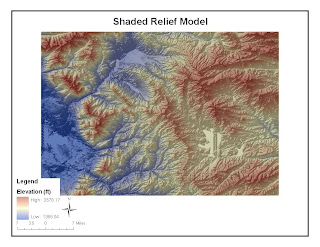
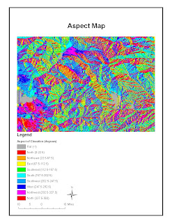
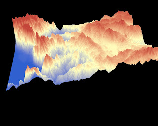
Lab 6: DEM
Wednesday, November 4, 2009
Lab 5: Map Projections
 Equal Area Map Projection
 Conformal Map Projection
Each map projection has a purpose: conformal maps maintain angular relations, equal area maps maintain area, equidistant maps maintain distance. Specified purposes are made easier through ArcGIS because all of the information can be stored digitally instead of on multiple paper maps. Furthermore, having different map projections saves time and eliminates some uncertainty for the viewer. For example, the equidistant maps shown above have the smallest difference in distance from Washington D.C. to Kabul than the conformal or equal area maps. This demonstrates the purpose of equidistant maps, though I believe the measurement performed in ArcGIS was inaccurate.
The biggest problems with different types of map projections include similar reference points and similar geometric projections. Conformal, equal area, and equidistant map projections maintain their specific features from a given reference point. If this reference point is changed between maps, the feature that should be maintained will be skewed (i.e. the distance from Washington D.C. to Kabul). I don't know if it was possible to make our own reference points in this assignment, so I assume this wasn't a major issue.
Similar geometric projections were an issue in this assignment. Most map projections were cylindrical and therefore had a rectangular shape, but some map projections weren't cylindrical. I think the ArcGIS measuring tool altered the distance between the two cities on these maps. For example, the distance on the equidistant conic map wasn't measured parallel to the latitude lines like the equidistant cylindrical map was. I believe this resulted in the 2000 mile difference between the two projections.
Saturday, October 24, 2009
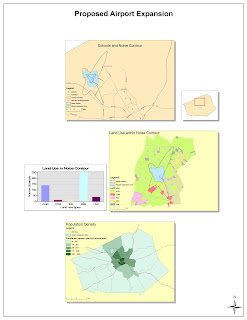
Week 4: ArcGIS
Sunday, October 18, 2009
Week 3 Lab: Dodgers 2009
View Dodgers 2009 in a larger map
The Dodgers 2009 map shows where each player on the current Dodgers roster went to high school. It's meant to show where a majority of baseball players come from (granted it's a limited sample set) and how far these people have traveled to play baseball professionally.
Making this map was an interesting learning experience. The "My Maps" function on Google provided easy to use tools to make participating in neogeography a possibility for everyone. I learned more about geography and the Dodgers than I expected to when I started this assignment because I was actually interacting with and integrating topics. This is the potential of neogeography: to expand the knowledge of users. The act of creating a map and integrating topics into it is fun, creative, and personal, yet it provides a deeper understanding of how subjects are interconnected for the creator and the viewer. The maps become dynamic and interactive for everyone, which stimulates people to learn and/or create something new. As this trend propagates, new conclusions can be made about the influence of space.
There are some drawbacks to neogeography. From a creator's perspective there is a slight learning curve involved with making a map. I noticed this when using Google's "My Maps" application. Fortunately I found a walkthrough online but I ran into trouble with "My Maps' when I accidentally double clicked on a marker and erased all the data it contained. This happened two or three times. It was definitely frustrating.
From a viewer's perspective, how does one know if the information in a created map is accurate? In my map for example, I couldn't find the location of some high schools. Instead of trying to "fudge" the information I simply placed the marker in the city the player was known to be from. There is too much room for error in reporting information properly.
Finally, the subject matter can be a concern. Issues like privacy and copyright can come into play when information, videos, or pictures are incorporated into a map. What is or isn't acceptable is at the discretion of the creator and their ethics.
Monday, October 12, 2009
Week 2 Lab: Beverly Hills Quadrangle
1. What is the name of the quadrangle?
Beverly Hills Quadrangle
2. What are the names of the adjoining quadrangles?
Canoga Park Quadrangle (top-left)
Van Nuys Quadrangle (top)
Burbank Quadrangle (top-right)
Topanga Quadrangle (left)
Hollywood Quadrangle (right)
Venice Quadrangle (bottom)
Inglewood Quadrangle (bottom-right)
3. When was the quadrangle first created?
1966
4. What datum was used to create your map?
North American Datum of 1983 (NAD 83)
5. What is the scale of the map?
1:24,000
6. At the above scale, answer the following:
a) 5 centimeters on the map is equivalent to how many meters on the ground?
1200 meters
b) 5 inches on the map is equivalent to how many miles on the ground?
1.9 miles
c) one mile on the ground is equivalent to how many inches on the map?
2.64 inches
d) three kilometers on the ground is equivalent to how many centimeters on the map?
12.5 centimeters
7. What is the contour interval on your map?
20 feet
8. What are the approximate geographic coordinates in both degrees/minutes/seconds and decimal degrees of:
a) the Public Affairs Building;
DMS:
Latitude: 34°04’30”N
Longitude: 118°26’15”W
DD:
Latitude: 34.075
Longitude: -118.4375
b) the tip of Santa Monica pier;
DMS:
Latitude: 34°00’30”N
Longitude: 118°30’00”W
DD:
Latitude: 34.0083
Longitude: -118.5
c) the Upper Franklin Canyon Reservoir;
DMS:
Latitude: 34°07’15”N
Longitude: 118°24’30”W
DD:
Latitude: 34.1208
Longitude: -118.4083
9. What is the approximate elevation in both feet and meters of:
a) Greystone Mansion (in Greystone Park);
560 feet, 170.69 meters
b) Woodlawn Cemetery;
140 feet, 42.67 meters
c) Crestwood Hills Park;
700 feet, 213.36 meters
10. What is the UTM zone of the map?
Zone 11
11. What are the UTM coordinates for the lower left corner of your map?
North 3,763,000 and east 361,500
12. How many square meters are contained within each cell (square) of the UTM gridlines?
1,000,000 sq. meters
13. Obtain elevation measurements, from west to east along the UTM northing 3771000, where the eastings of the UTM grid intersect the northing. Create an elevation profile using these measurements in Excel (hint: create a line chart). Figure out how to label the elevation values to the two measurements on campus. Insert your elevation profile as a graphic in your blog.

14. What is the magnetic declination of the map?
14°
15. In which direction does water flow in the intermittent stream between the 405 freeway and Stone Canyon Reservoir?
South
16. Crop out (i.e., cut and paste) UCLA from the map and include it as a graphic on your blog.


