Saturday, October 24, 2009
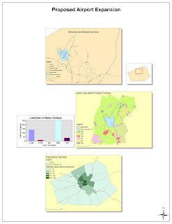
Week 4: ArcGIS

Sunday, October 18, 2009
Week 3 Lab: Dodgers 2009
View Dodgers 2009 in a larger map
The Dodgers 2009 map shows where each player on the current Dodgers roster went to high school. It's meant to show where a majority of baseball players come from (granted it's a limited sample set) and how far these people have traveled to play baseball professionally.
Making this map was an interesting learning experience. The "My Maps" function on Google provided easy to use tools to make participating in neogeography a possibility for everyone. I learned more about geography and the Dodgers than I expected to when I started this assignment because I was actually interacting with and integrating topics. This is the potential of neogeography: to expand the knowledge of users. The act of creating a map and integrating topics into it is fun, creative, and personal, yet it provides a deeper understanding of how subjects are interconnected for the creator and the viewer. The maps become dynamic and interactive for everyone, which stimulates people to learn and/or create something new. As this trend propagates, new conclusions can be made about the influence of space.
There are some drawbacks to neogeography. From a creator's perspective there is a slight learning curve involved with making a map. I noticed this when using Google's "My Maps" application. Fortunately I found a walkthrough online but I ran into trouble with "My Maps' when I accidentally double clicked on a marker and erased all the data it contained. This happened two or three times. It was definitely frustrating.
From a viewer's perspective, how does one know if the information in a created map is accurate? In my map for example, I couldn't find the location of some high schools. Instead of trying to "fudge" the information I simply placed the marker in the city the player was known to be from. There is too much room for error in reporting information properly.
Finally, the subject matter can be a concern. Issues like privacy and copyright can come into play when information, videos, or pictures are incorporated into a map. What is or isn't acceptable is at the discretion of the creator and their ethics.
Monday, October 12, 2009
Week 2 Lab: Beverly Hills Quadrangle
1. What is the name of the quadrangle?
Beverly Hills Quadrangle
2. What are the names of the adjoining quadrangles?
Canoga Park Quadrangle (top-left)
Van Nuys Quadrangle (top)
Burbank Quadrangle (top-right)
Topanga Quadrangle (left)
Hollywood Quadrangle (right)
Venice Quadrangle (bottom)
Inglewood Quadrangle (bottom-right)
3. When was the quadrangle first created?
1966
4. What datum was used to create your map?
North American Datum of 1983 (NAD 83)
5. What is the scale of the map?
1:24,000
6. At the above scale, answer the following:
a) 5 centimeters on the map is equivalent to how many meters on the ground?
1200 meters
b) 5 inches on the map is equivalent to how many miles on the ground?
1.9 miles
c) one mile on the ground is equivalent to how many inches on the map?
2.64 inches
d) three kilometers on the ground is equivalent to how many centimeters on the map?
12.5 centimeters
7. What is the contour interval on your map?
20 feet
8. What are the approximate geographic coordinates in both degrees/minutes/seconds and decimal degrees of:
a) the Public Affairs Building;
DMS:
Latitude: 34°04’30”N
Longitude: 118°26’15”W
DD:
Latitude: 34.075
Longitude: -118.4375
b) the tip of Santa Monica pier;
DMS:
Latitude: 34°00’30”N
Longitude: 118°30’00”W
DD:
Latitude: 34.0083
Longitude: -118.5
c) the Upper Franklin Canyon Reservoir;
DMS:
Latitude: 34°07’15”N
Longitude: 118°24’30”W
DD:
Latitude: 34.1208
Longitude: -118.4083
9. What is the approximate elevation in both feet and meters of:
a) Greystone Mansion (in Greystone Park);
560 feet, 170.69 meters
b) Woodlawn Cemetery;
140 feet, 42.67 meters
c) Crestwood Hills Park;
700 feet, 213.36 meters
10. What is the UTM zone of the map?
Zone 11
11. What are the UTM coordinates for the lower left corner of your map?
North 3,763,000 and east 361,500
12. How many square meters are contained within each cell (square) of the UTM gridlines?
1,000,000 sq. meters
13. Obtain elevation measurements, from west to east along the UTM northing 3771000, where the eastings of the UTM grid intersect the northing. Create an elevation profile using these measurements in Excel (hint: create a line chart). Figure out how to label the elevation values to the two measurements on campus. Insert your elevation profile as a graphic in your blog.

14. What is the magnetic declination of the map?
14°
15. In which direction does water flow in the intermittent stream between the 405 freeway and Stone Canyon Reservoir?
South
16. Crop out (i.e., cut and paste) UCLA from the map and include it as a graphic on your blog.
Sunday, October 11, 2009
Week 1 Lab: 3 Maps
The map shown above is a global pollution map that shows levels of particulate matter by region. It was taken from a company's website where its purpose is to display regional pollution information. This is different from the previous map which is meant to give directions. Notice that this map doesn't show a rosette to indicate direction because it's understood (by convention) that north is up on a map. I find this map interesting because the conclusions that can made from it apply to fields outside of geography (i.e. government policies). For example, the map shows that PM10 levels are lower in highly developed countries than they are in less developed countries. This can be due to different environmental laws or different natural resources.
The map shown above is a topographical map typically found in an atlas. This type of map uses contour lines to display elevation of the landscape, giving a third dimension to a 2-dimensional map. This particular map doesn't show a rosette because it is a small portion of a larger map. However, topographical maps usually follow the convention of north is up. I find this map interesting because it incorporates mathematics into reading it properly. One must understand the general principles of slope. The closer the contour lines are spaced, the steeper the landscape is. Similarly, the wider the contour lines are spaced, the more level the landscape is.

