
The map shown above is the type of map typically seen in a mall directory, usually accompanied by a large key that lists the meaning of the numbers and symbols shown on the map. The map shows the reader where stores are located in relation to one another; thus, directions around the mall are based on reference points. The extent of the map is small (only one floor of a mall) yet it provides so much information: locations of stores, types of stores, various starting points, and emergency locations. I find this particular map interesting because this map does not follow the mapping convention that north is up. Perhaps north is to the right because the map is supposed to orient the reader to their immediate position rather than their global position. But then why not position the mall directory so that north is up? Maybe the space allocated for the map is too small and it would be difficult to read otherwise.

The map shown above is a global pollution map that shows levels of particulate matter by region. It was taken from a company's website where its purpose is to display regional pollution information. This is different from the previous map which is meant to give directions. Notice that this map doesn't show a rosette to indicate direction because it's understood (by convention) that north is up on a map. I find this map interesting because the conclusions that can made from it apply to fields outside of geography (i.e. government policies). For example, the map shows that PM10 levels are lower in highly developed countries than they are in less developed countries. This can be due to different environmental laws or different natural resources.
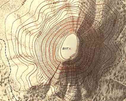
The map shown above is a topographical map typically found in an atlas. This type of map uses contour lines to display elevation of the landscape, giving a third dimension to a 2-dimensional map. This particular map doesn't show a rosette because it is a small portion of a larger map. However, topographical maps usually follow the convention of north is up. I find this map interesting because it incorporates mathematics into reading it properly. One must understand the general principles of slope. The closer the contour lines are spaced, the steeper the landscape is. Similarly, the wider the contour lines are spaced, the more level the landscape is.
No comments:
Post a Comment